Loading…
Flat
Roughly in fashion 2012–2018
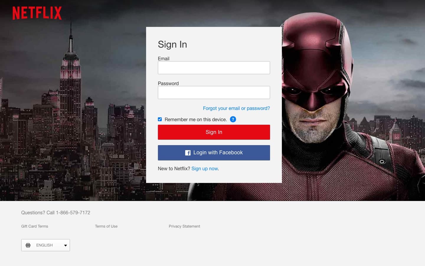
Solid colour, no textures or shadows, thin type and simple geometric icons. Popularised by Microsoft's Metro (2010) and made mainstream by iOS 7 (2013), it was a reaction against skeuomorphic excess. Pure flatness hurt affordance, so it softened into “flat 2.0” with subtle shadows and layers.
Versions with this style, per year
20132023